iDig packaging – 2019
One of the projects I played a key role in was iDig, a product designed for dogs that love to dig. Created at iFetch’s request, it embraces and satisfies the natural digging instinct of dogs. I took a central role in every stage, from the initial concept to production and packaging design, focusing on creating a product that allows dogs to enjoy their natural behavior rather than suppressing it.

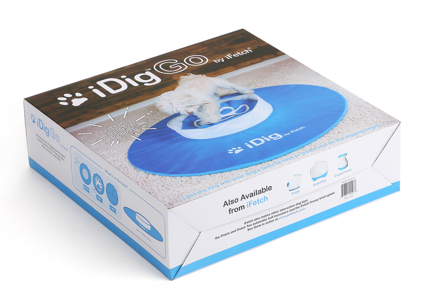
The packaging design for iDig, one of iFetch’s signature dog toys, was carefully crafted to maintain brand consistency while effectively highlighting the product’s appeal. Using iFetch’s signature blue and white color scheme, the design ensures a cohesive and recognizable brand presence. The front of the box features a bold, high-quality image of the product, creating a strong visual impact while keeping additional information to a minimum. This restrained approach enhances the product’s perceived value, giving it a sleek and premium feel. To provide essential details without clutter, a "What’s in the Box" section was included, offering a clear overview of the product's components before purchase
The sides of the packaging incorporate minimalist line-drawn pictograms to communicate key features visually. This design choice allows customers to quickly grasp the product’s functionality at a glance, without relying on excessive text. By eliminating unnecessary elements and maintaining a clean layout, the packaging presents the product in a refined and professional manner.
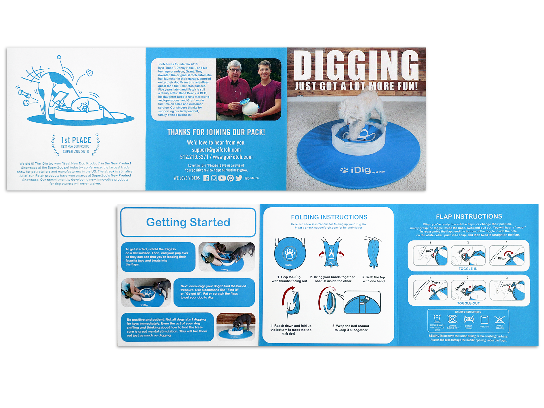
Inside the package, the brochure serves as a user-friendly guide, offering detailed instructions on how to use iDig effectively. It explains play methods, packing techniques, flap replacement, and washing instructions, ensuring a seamless user experience. To reinforce trust in the product, the brochure also includes iFetch’s award recognitions and company information, along with clear customer service details for added reassurance.

The brochure’s design follows the same blue-and-white color scheme as the packaging, maintaining visual consistency and reinforcing brand identity. This cohesive approach ensures a smooth transition from unboxing to product use, enhancing both clarity and brand recognition. The overall design philosophy prioritizes clarity and functionality, delivering key information in a polished and professional manner while focusing on the product’s quality and appeal.


